What I'll cover
Website Design Brief
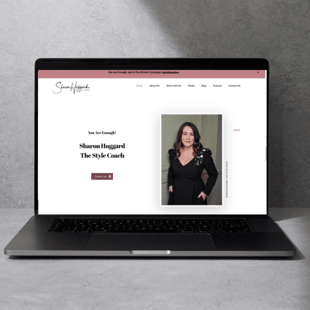
Sharon Huggard The Style Coach is an award-winning International Style Coach who wanted to revamp her existing website to reflect how her business has grown and evolved. Sharon has been featured several times in the media, but it wasn’t reflected on her existing website. She also wanted to “zhuzh” up her site aesthetic and update her services pages as her offers had changed.
I was really excited to get my teeth into this project as I could see Sharon’s business had changed so much since her starter website had been built. We had a couple of initial calls and it quickly became clear that we were looking at a website redesign. Sharon has recently won a business award and her media appearances have been prolific, but there was no sign of them on her existing website. Since starting out in business she has qualified as a QTT Practitioner and has gained numerous powerful testimonials.
Sharon’s previous website had a separate testimonials page and I felt it would be better to weave her fantastic testimonials throughout her website as social proof. Seeing as the Home Page is the most visited page on the website, we agreed to showcase some testimonials there to showcase her expertise.

Feeling empowered
Sharon longed to feel empowered to make edits to her website – like many solopreneurs her business evolves quickly, so it’s important that she can tweak her offers to reflect what’s happening. She has regularly appeared on podcasts or been featured in the press so she wanted to be able to add these links to her website without relying on someone else. That meant we needed to choose a theme that is easy to edit. so we went for a gorgeous Gutenberg-based theme with an aesthetic Sharon loved. I’m a qualified IT trainer and have a primary teaching background, so when a client tells me they want to learn a new skill, that’s music to my ears! I was delighted to make quick videos to show Sharon how to tweak her website and I loved that she told me she felt empowered because she’s able to make these edits herself.
I love Sharon’s message of empowering women to “start making memories” and to “get in the picture” of their lives. Sharon has grown her social media following, so we wanted to create “doorways” on her website inviting website visitors to join her free Facebook community and follow her on Instagram for relatable tips and updates on her programmes and forthcoming podcast.
The design brief was to build a beautiful, clean coaching website reflecting how Sharon’s business has evolved, showcasing Sharon as an award-winning business owner, her current offers and her expertise.
A branding goal was to build an aesthetically pleasing website. We chose modern fonts that are readily available on Canva to ensure consistency when Sharon posts on social media. Sharon had already carefully selected her colour palette, so we used these colours for contrasting buttons and other design elements, such as bullet points. If you need help choosing colours for your coaching website, check out this blog post for simple tips.
Website Imagery
Sharon has beautiful professional photographs so we optimised these images for her website. Being a stylist, we wanted to create a clean website with plenty of whitespace and chose beautiful iconography to reflect Sharon’s attention to detail. Instead of using bullet points, we used iconography such as hearts, arrows and stars.

On Sharon’s services pages, we created mockups to help clients visualise her programme content – giving a sneak peek of the bonus content in her offers. When a programme is online mockups and images of the programme content can help potential participants to understand the quality of what’s included.

Whitespace, contrasting buttons for CTA’s (calls to action) and borders enhance the user experience and make the site easy to navigate. We included lots of internal links to help visitors easily move around the site and find what they are looking for.
Website Branding and Features
Sharon had a number of brand assets in place before we began the project. However, we worked together to choose appropriate typography (fonts) and focused on how we could highlight the beautiful professional photographs she had.

This website was custom-built and a labour of love! We included numerous clickable buttons to make it easy for clients to get in touch with Sharon and book a clarity call.
We created sub-menus to help potential clients to understand Sharon’s offers and included FAQs for clarity.
Given Sharon’s frequent media appearances – on tv, podcasts and print and online media, we created a dedicated media page and a downloadable media kit. Sharon’s media kit showcases her credentials and where she has been featured. It’s easy for Sharon to share the link with the press and is a testament to how she has grown as a business owner.
One of my values is working with clients who make an impact in the world. It’s a special delight to work with women in business who help others. I’m so proud to have worked with Sharon to get this project out into the world.
Redesigning my website was a huge undertaking. It was definitely outside my comfort zone, but my old website was not reflective of the me I am now and where my business is at. It was time to level up. From our first call to our final voice notes I knew I was in safe hands. Marie has the patience of a saint. She’s so professional and never makes you feel silly. Her vision and attention to detail is truly outstanding. I feel empowered to make necessary tweaks and updates and have control of my own website…vital going forward. For years I outsourced my power and I hadn’t access to my own website, therefore it was stagnant and did not reflect my business that was growing and evolving.
I can 100% recommend Marie. She just takes the stress out of it for you and what a beautiful website you will have to reflect you and your business. This ain’t no template copy and paste website, it’s created with love. ?
Sharon Huggard
Award-winning International Style CoachView my therapy and coaching website portfolio.
More about the website
Launch Date: 2022
Industry: Style Coach
Location: Cork
Project type: Web Design, Branding
Ready to get started?
Click Get Started or get in touch with any questions.
If you’re thinking of getting a new website, don’t feel like you have to spend hours battling through YouTube videos and DIY it. That’s not an effective use of your time.
If you need someone who understands the sensitivities of the coaching and therapy space to help you to create a website you love that connects with your clients, get in touch.


