What I'll cover
The Design Brief
Amanda Delaney is a highly experienced Business Coach who wanted a new WordPress website to showcase her services. Amanda had a wealth of content, including media appearances, client wins and photos of her in action. She also wanted to work with a web designer who could create a strategy and build a professional website that would feel authentic.
Website Discovery Phase
If I’m completely honest, I was simultaneously scared and excited when Amanda Delaney asked me to build her business mentor website! I knew from the outset that it would be a massive project with a lot of eyes on it and I really wanted her new website design to showcase her services, her client wins and to speak to her dream clients.
Website Strategy
All my website projects start with a strategy session to learn about you, your business and your clients. Luckily because Amanda is my coach, I had a good insight into her business and her programmes and that knowledge was really helpful in giving me a vision for her website.
Amanda works with a lot of life coaches and therapists and I knew that it would be really inspiring for them to see and hear the results that Amanda’s clients have achieved.
So poor Amanda quickly got a LOT of homework – gathering testimonials and photos of her clients in action. #sorrynotsorry – these elements tell a visual story, so even the skimmers and scanners get the gist that she’s a coach whose clients get results.

Amanda helps coaches and therapists to build the business and life they truly desire, so our next step was to figure out her customer personas and what they might be looking for from a business coach and mentor at different points in their business journeys. Obviously, with Amanda being a marketing expert she knew her ideal clients and their struggles inside out.
Amanda and I know each other quite well, that’s probably a good thing because I have regular Zoom calls with my VIP clients and a little bichon called Lily is likely to sit in on these meetings!
The discovery phase happened online – I interviewed Amanda and transcribed our notes to make sure that I was capturing everything about how her coaching business works.
Website Branding and the Customer Journey
Amanda felt that her brand had evolved so it was really important to dig into who she is now, who she helps and to make sure that the copy and design felt authentic. Amanda had been on a huge personal development journey, completing QTT certification, NLP and also a Train the Trainer course.
But that was only the start of her website discovery phase! Because we also had to think about her customer journey and her offers.
Despite what you might think, there’s a lot more that goes into a website design than just choosing a beautiful colour palette!
Luckily for me, with Amanda’s marketing expertise, she was already clear on her dream client, so that made it much easier to nail down her services and ensure that we were able to provide free and paid offers that would meet potential clients where they are at.
For example, Amanda chose the perfect evergreen freebie (also known as a lead magnet) that would help clients quickly create oodles of content for their businesses – more on this later.

Amanda also wanted to create a simple welcome sequence (a series of emails that are automatically sent when someone signs up for her newsletter list) that would help her target audience (coaches and therapists who are ready to grow their businesses).
She’d also been a Network Ireland judge, so once again she was assigned plenty of homework to gather all her qualifications and credentials to make sure we were leaving nothing out. When people are looking for a business coach they want to know that you know what you’re on about – that builds trust.
Your website branding is so much more than picking attractive colours and a nice font. It’s about who you are as a person, your mission, your vision and your values, your services and the customer journey.
Copywriting and Content
Remember that transcript I talked about earlier? There were two reasons for this – I used it when writing the website copy and I also created a document with useful snippets and gold nuggets that Amanda came out with on our calls. These can be repurposed and used on social media or in future blogs.
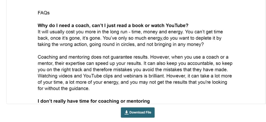
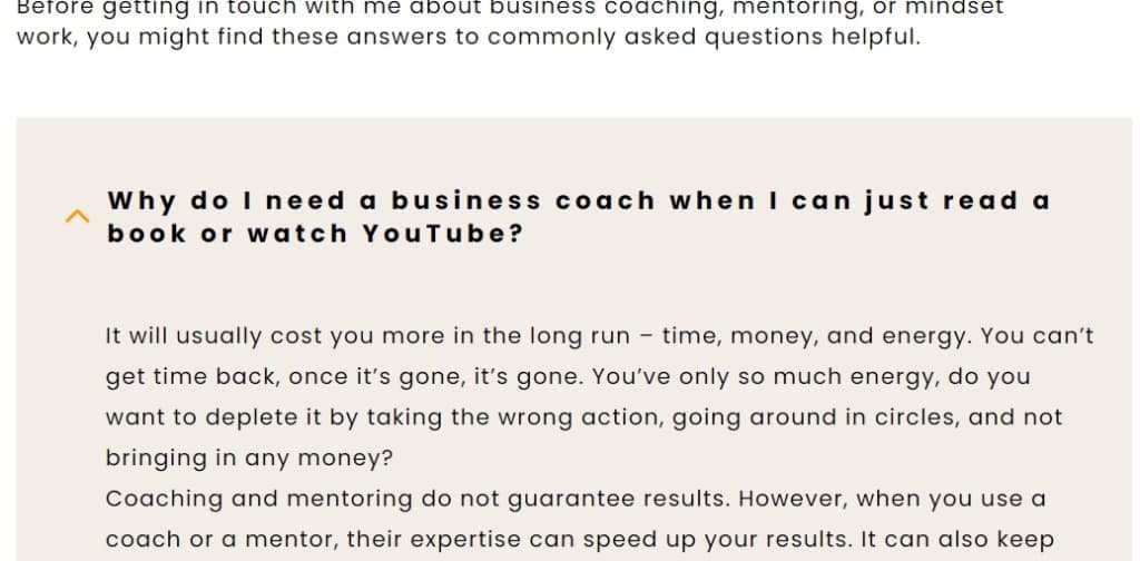
Having a transcript made it so easy to write FAQs because they came out naturally in conversation as we talked about the customer journey and what Amanda’s people are stuck on and her solution.
As we worked together, it became clear that Amanda would need two new pages on her website – a media page to highlight her TV, radio and podcast appearances and a speaking page to highlight that this woman is an excellent Keynote Speaker!
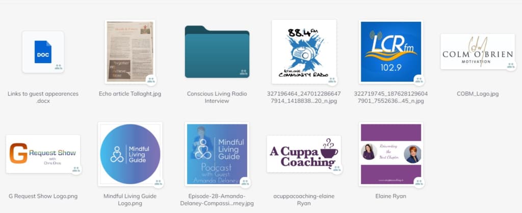
Once again, Amanda had her work cut out, collecting links to all the places she had been featured, logos and images.
As you can see, there’s a lot of work that goes into gathering content and figuring out what’s unique about your offers before you even lay a finger on the tech!
That’s why if you’re thinking about having a website design or redesign, it’s best to get cracking on your project sooner rather than later, especially if you have a Trading Online Voucher because the deadline comes around a lot quicker than you’d think!
The Web Design Process – business coach website design
I asked Amanda to select three websites she really loved as a visitor and we thought about the features that appealed to her, in terms of design and functional elements. This helped me to get an insight into designing a website that would feel like hers.
The initial brief was to build a new WordPress website, but as we put our heads together, that quickly expanded to devising the website strategy, migrating to a new host, setting up a new email marketing system, embedding a calendar and copywriting (writing the words).
Amanda completed a questionnaire helping me to figure out the functionality she’d need on her new website – things like a scheduling calendar so clients could book a call and a link to her membership site.
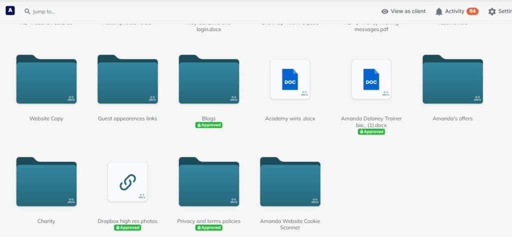
Needless to say, this was a big project to manage! I genuinely think this is why a lot of DIY projects never get finished, it can feel a bit like herding cats when you’re trying to manage and keep a handle on all the different elements. ?
Amanda needed to move her website host, so we did this early on and made sure her new email address was working properly. It’s a big job to migrate (move) a website, so if you are changing hosts, ensure you allow enough time.
She also changed her email service provider for her marketing emails, so there was testing involved to check everything was working smoothly.
Amanda had an amazing photoshoot with Éadaoin of Fire Child Photography and the images taken on the day are truly stunning and capture attention.

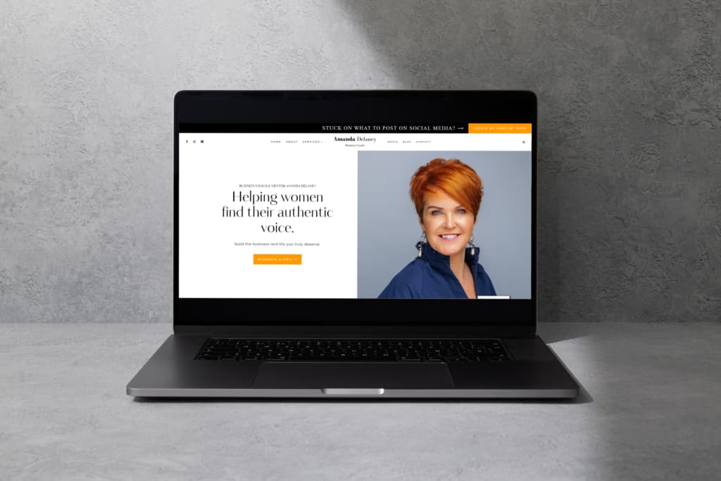
We used the colours from her branding photos to inspire her website colour palette – a vibrant orange that we used for links and call-to-action buttons.

I built a coming soon page featuring one of Amanda’s new branding photos and a simple sign-up form so if anyone landed on the page while I was designing the site they could sign up for one of her workshops.
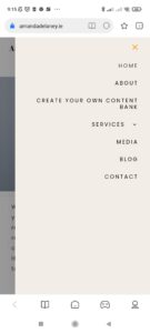
I designed two menus – one for mobile and one for desktop/iPad so that no matter what device someone is using it’s quick to navigate the site and find what they are looking for. A high-converting site is one that doesn’t confuse everyone!
The Home Page
This starts with a fab photo of Amanda, courtesy of Firechild Photography, who she helps, what she helps them with and a call-to-action button.
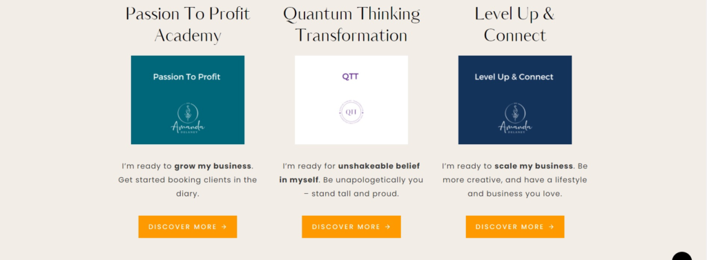
Next, it features a selection of her services, and who each one is suitable for according to the stage her ideal clients are at when it comes to their practice.
We then move to a little of Amanda’s story, with a link to her about page to discover more – linking to other pages on your site is great for SEO (Search Engine Optimisation) because it helps the search engines to understand what your site is about. It also means that visitors can quickly glean what you do, who you help and why they should choose you.
After that, there’s a selection of real-life client wins – this helps someone who is new to Amanda’s world to understand the transformation you can get from working with a mentor, both personally and professionally. It also serves as a reminder for previous happy clients of the outcomes they achieved when working together.
Amanda has helped hundreds of businesses to flourish and that proves that her systems work.
The home page features testimonials from Amanda’s clients and their photos – the home page is one of the most visited pages on your website, so it makes sense to add testimonials as social proof here. There are also video testimonials as it is very powerful to hear past clients share their results.
The whole page is designed to speak to potential clients and highlight the benefits of hiring a coach and mentor.
Finally, there is a link to Amanda’s blogs sharing her marketing and mindset wisdom.
The About Page
This page is of course about Amanda, but it’s also speaking directly to her ideal clients. She shares her own journey and encourages others to think and believe that it’s possible for them too.
There are trust signals on the About page that highlight Amanda’s expertise and credentials and we also discover some of the places where she has been featured, sharing her expertise.
A lot of care goes into structuring an About page that brings the visitor on a journey. We chose to link to Amanda’s speaker page and also her media appearances to show the path she has been on as both a coach and entrepreneur. I wanted to make it really easy for Amanda to pitch for future guest expert slots, so I added a feature to download high-resolution headshots.
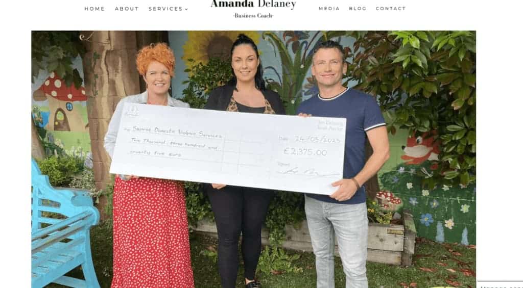
As we worked together, Amanda mentioned that one of her values is fundraising for charities that are close to her heart, so I added a section featuring some of her recent fundraising activities. You might not be consciously aware of it, but I bet if you think about it that you can remember when you’ve chosen to hire someone because your values align. Don’t be afraid to bring your values and ethics into your brand story – it can help people to connect with you.
Once again, I want to highlight that website design for coaches involves a lot more than choosing a pretty theme. Done carefully it can really emphasise why your ideal client should choose you.
This article was a bit of a beast to write, but I wanted to share a few gold nuggets with you about the thinking that informs design choices – hopefully, it has given you inspiration for your own site.
I hope you enjoyed reading this sneak peek of what goes on behind the scenes of a business coach website design and that you have a newfound insight into why you might hire a web designer instead of going the DIY route.
Please note that copywriting does not come as standard as part of your website design when you hire me. It is an additional, optional package.
Get in touch if you would like to book a complimentary, no-obligation call to discuss your vision for a new website or a website redesign. I’m happy to quote you based on your specific needs.
>>Be sure to check out this post if you are getting ready for a website redesign.
