So you’re thinking of getting a new coaching website and you’re wondering why web design is important. In this blog post, I’ll explore key coaching website best practices. Read on if you want to figure out what coaching websites that work have in common.
By paying attention to these tips on coaching website best practices you can get the most out of your website – making sure that it works for you AND for your website visitors.
8 Tips to Create a Coaching Website That Captivates
- Clarity on your niche – is it instantly clear who you help?
- An SEO-friendly H1 heading that includes your targeted longtail keywords
- An uncluttered navigation menu that enhances the user experience
- Uplifting images and professional photographs of you
- White space and legible typography
- Clear CTA (call to action) buttons in a contrasting colour
- Trust signals – your qualifications, accreditation, etc.
- A valuable freebie to build your email list
Maybe you’re thinking of building a DIY coaching website. You absolutely could – IF you have the time, energy and tech skills.
Whether you decide to DIY or hire a designer, I’d like to explain why web design is so important for your coaching business and point out some best practices that you mightn’t have thought about.
Of course, you’re going to want to have a beautiful website that’s attractive to look at, but you also need to think strategically about your aims for your website so that it actually helps to grow your coaching business.
There’s no point in building a gorgeous website that potential clients click away from.
Coaching Website Best Practices – Essential Web Design Tips:
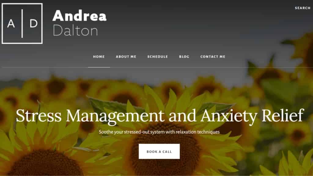
Optimise Your Home Page – Coaching Website Best Practices
What’s your favourite testimonial? The one you feel proudest of? Don’t bury it on a page called “testimonials” or “client love”. Add it to your home page – give people a sense of what you’re like to work with and the transformation you deliver straight away.
I don’t see the sense of having a separate testimonials page. To my mind, your home page and about page are the two most visited pages on your website, so why not make it easy for people to see the magic of what you do? And add testimonials to any services pages because it might help someone to get off the fence when they read the powerful shifts other clients have achieved. And if you have eCommerce functionality, make sure to add testimonials as social proof to your cart or checkout pages and avoid hesitancy when it comes to clicking your buy button.
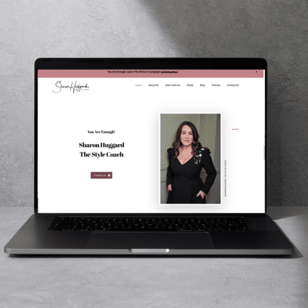
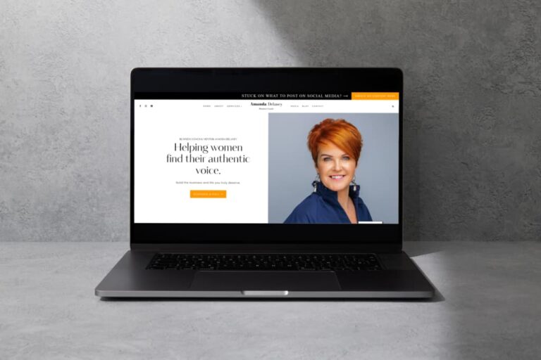
➡️Make sure that it’s instantly clear who you help
➡️Use an H1 title so that the search engines can identify what you are trying to rank for – “Stress Management and Anxiety Relief” in the example image above
➡️Your logo should display on the top left
➡️Keep your logo simple with a transparent background, so that it’s easy to use on other marketing materials
➡️A search bar is useful because it allows potential clients to quickly find what they’re looking for
➡️Make sure that the navigation bar is clear and uncluttered (the menu that displays the pages on your website)
➡️Avoid adding social links to the top of the home page as more than likely visitors will get distracted if they open up social media. It’s also not good for your website as if visitors click away quickly after landing on your home page it indicates to the search engines that your content isn’t very helpful.
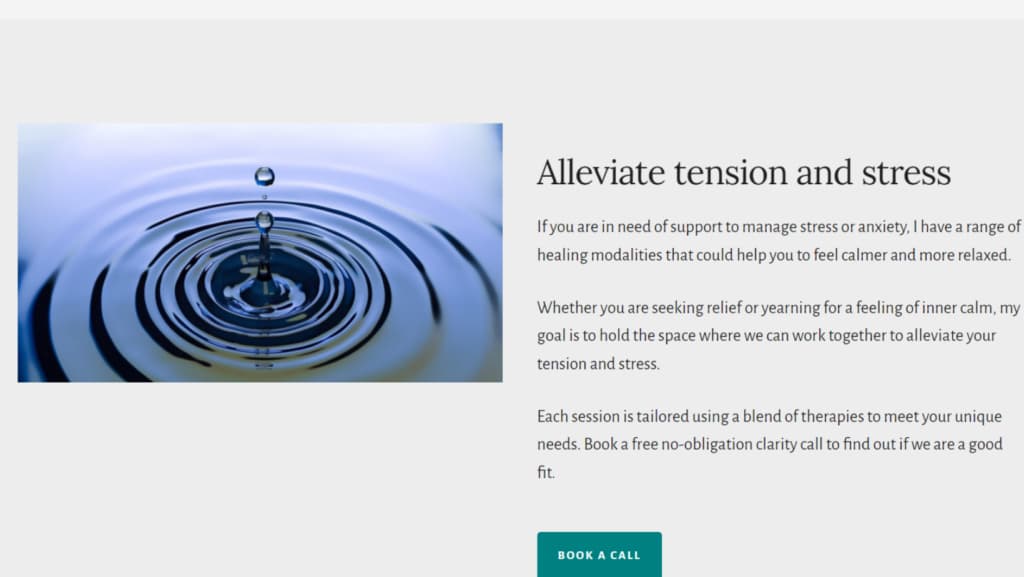
➡️Use soothing, uplifting and positive pictures that conjure up an image of how clients will feel once they access your support.
➡️Don’t be afraid to use plenty of white space – break up the text visually with columns, short paragraphs and plenty of images.
➡️Add CTA (call to action) buttons in a colour that stands out. Don’t give these obscure titles like “I’m in”, label them clearly, e.g. “book now”, or “schedule a free clarity session”.
Crafting a Compelling About Page For Your Life Coaching Website
➡️ Add a photo of you smiling and looking approachable, professional headshots will elevate your site,
➡️ Add your title and again make it really clear who you help and with what.
➡️ White space is important once again to make reading your about page less jarring for the reader.
➡️ You can add in your qualifications, skills, experience, accreditations and anywhere that you’ve been featured, but don’t make it the first thing a visitor sees when they land on the page.

➡️ Remember that your About page is about helping potential clients to see themselves working with you, so think about what they’d need to hear in order to feel safe enough to get in touch.
➡️ Avoid jargon, use plain English to get your point across.
➡️ All else being equal, clients don’t pick a coach because of WHAT you do, they pick someone they can relate to, someone who helps them to feel safe enough to open up about what’s going on for them.
➡️ They want to get a sense of what it’s like to work with you.
➡️ When they feel like you’re the person who can help them, they’ll book in to find out more.
As a life coach, you’ll know that this is a competitive space, that’s why you need clarity on your niche, messaging that positions you as an expert and a website that gets your ideal client thinking “this is who I want to work with”.

What should a Coaching Website include (that’s different to other websites)?
Whether you’re a life coach, a health coach or offer executive coaching, your website design needs to be strategic to bring your customers on a journey.
Your coaching clients may be feeling frustrated or overwhelmed, and the best coaching websites focus on making it easy for them to work with you by outlining your packages and programmes and who they’re a fit for.
Services Page
Hopefully, this isn’t your first rodeo, so you’re clear on your messaging and positioning. Maybe you’ve signed up for business coaching and are crystal clear on who you help. Your website strategy needs to bring your customers on a journey and a great coaching website makes it easy for visitors to book a call with you to find out if you’re the right fit.
➡️ Give your offers or programmes names that are clear to the reader.
➡️ Include a description of what each offer is.
➡️ How many sessions?
➡️ Online or face-to-face?
➡️ 1:1 or group?
➡️ How does it work?
➡️ Why is it helpful? (evidence-base)
➡️ You can briefly mention each service with a picture and then make a clickable link where the reader can discover more about an individual service on a separate page.
➡️ If you are selling an online course or programme, including mockups of any training materials can help potential clients better understand what you offer.
If you offer online coaching, remember that potential clients might not be techy – how can you assuage their fears? That might mean explaining what happens if they can’t connect on Zoom or if the internet drops out halfway through a call. Reassure them about the measures you have in place to ensure that your session is confidential and how they can get the most out of their session by ensuring they won’t be disturbed.
Create a Contact Page that Connects
Life Coaching is all about connection, so optimise your website by eliminating objections to working with you.
➡️ If you are based in a centre, consider adding a Google map so that clients can easily locate the premises (search engines love this).
➡️ Add the street address and postcode and let them know if there is parking available nearby.
➡️ Remember that not everyone will feel comfortable picking up the phone to book an initial session.
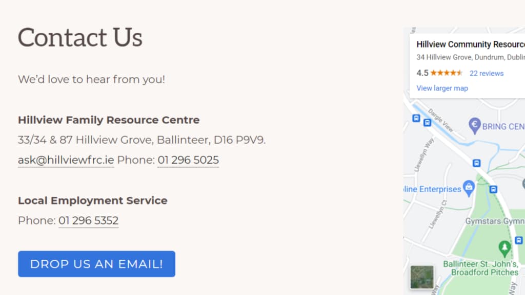
➡️ Give potential clients multiple ways to contact you – phone, email and a contact form. Don’t forget to link to your online scheduler too.
➡️ Don’t forget to test your contact form occasionally. Imagine how it would feel for a client to pick up the courage to get in touch and then wonder why you haven’t replied.
➡️ Set expectations about how often you check your email/voicemail/messages – give them an idea of how long it typically takes you to respond.
Thinking about getting a coaching website that converts? Visit my portfolio to view my work or comment below if you have any questions.


