Let’s talk about how to choose colours for a website. It’s worth thinking about the visual elements of your website because when you pick the right colour scheme it can add personality, help your business to stand out, and speak to the clients you’d like to work with.

What I'll cover
What is the best colour for a website?
The human eye can detect about a million colours, so it’s easy to see why picking a website colour scheme can seem like an overwhelming task!
Colour has different meanings in different cultures. You might also have a personal association with a colour that’s unique to you, for example, you might hate a colour because it reminds you of your school uniform! In other words, colour can be a matter of personal taste.
When it comes to choosing your website colour scheme, it needs to appeal to your target audience.
It might be that you love the colour red, but it could have associations with danger (think of traffic lights and warning signs). That doesn’t mean that you shouldn’t use red on your website, but it’s worth thinking about the associations others might have with the colour, even if they’re subconscious.
You don’t want there to be a disconnect between your chosen colour palette and the feeling you are trying to evoke in the visitor.
For example, if you want to convey a feeling of calm and serenity, you would probably avoid dark colours and choose soothing tones that most people associate with relaxation, such as greens, blues and colours found in nature.
Colour psychology and colour theory can be very helpful when it comes to picking your colours. For example, many healers use colours such as purple to represent spirituality and intuition.
Luckily there are a number of tools you can use to help you choose colours for a website.
Choosing a website colour scheme
Choosing a website colour scheme is something that a lot of people can struggle with, especially if you’re not a designer.
When it comes to choosing your colours, remember that it’s about choosing a colour scheme that creates a positive association with your brand. But before you get started, remember it’s not necessarily about choosing your favourite colours.
The best colour scheme for your website will depend on your brand and your target audience. You also want to make sure that your chosen colours don’t detract from your message.
Researching your ideal client and thinking about who you want to work with can help you when it comes to picking the perfect website palette for your business.
Before you decide on the right colours for your brand, it’s worth asking yourself
- who do I want to work with?
- how do I want visitors to feel when they land on my website? e.g. calm, reassured, ready to take action, etc.
Once you have a sense of who your website needs to appeal them and the feeling tone you’d like to evoke, use a colour palette generator to select a range of colours that will work together.
But before you have your heart set on a colour palette, make sure to run it through contrast checkers and to test if it is easily legible if the reader is colour blind.
How many colours should a website have?
Colour should be used with discernment. The colour scheme you choose should complement your message and design, not overpower it.
You’ll definitely want a distinctive, contrasting colour to draw attention to CTA (Call to Action) buttons so that they stand out on the page.
You’ll also need an accent colour for when a website visitor is hovering over a button or menu item. A pale background colour is advisable because it doesn’t detract from your message and allows your other colours to pop.
Colour and accessibility
There needs to be a good contrast between the text and background colour on your website, otherwise, it will be difficult to read.
Bear in mind that red or green are typically very difficult to distinguish for people who experience colour blindness.
Some colours might look beautiful to us, but when you run them through a colour contrast checker, you might discover that they are difficult to read and best avoided.
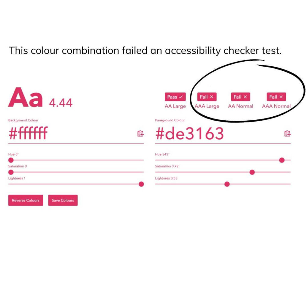
Here’s an example – a client had her heart set on a pink and white colour palette, but when we ran her chosen colours through an accessiblity checker – she was shocked to discover the combination failed colour contrast checks.
If the client had stuck to the original colour combination she had chosen, people would have really struggled to read the text on her website because there wasn’t enough contrast between the background and her chosen font colour. That means that some clients who really need her help could have missed out on the help she offers.

Tools to help you pick the perfect website colour palette
Colour palette generators

Online colour palette generators are fantastic if you’re seeking colour inspiration, especially if you’re starting with a blank slate.
These tools are free and very easy to use. In this post, I’m going to share a couple of my favourites and how to use them.
Did you know that Canva has a colour palette generator? If you have an image that contains a colour you love, you can simply upload it to the generator and it will help you to identify the hex code
It can be really hard to imagine how your chosen website colours will look together or to figure out if the individual colours will complement each other and be in alignment with your business.
Try using coolors.co to generate a colour palette. Here’s a quick video showing you how this tool works:
That’s why it’s a good idea to use online tools to help you decide on your final selection.
You can use a colour palette accessibility checker to make sure that the colours you use on backgrounds, links, buttons, etc. work well together.
Not only is this a more inclusive way to pick your colours, but it can also impact your SEO because if your website isn’t providing a good UX (user experience), visitors are more likely to click away.
Website colour picker
Colorzilla can help you to identify the colour codes used on a website. It’s a really useful tool if you are inspired by a colour and want to find the code.
Pro tip
When you choose your colours, make a note of them and keep them somewhere you can easily reference them!
Some of my clients have sellotaped their colours to their laptops to make it easy to grab the correct hex codes whenever they need to.
If you use Canva Pro, add your chosen hex codes to your brand board so that you can easily grab them when you’re creating a design.Lorem ipsum dolor sit amet, consectetur adipiscing elit. Aenean diam dolor, accumsan sed rutrum vel, dapibus et leo.
How to add your brand colours to Canva Pro
My final tip is that it’s easy to change the colours on your website in your settings, so don’t worry if you feel like the colours you’re using at the moment aren’t working to your advantage.


